Relevant to:
Express
This article is relevant to Express Builder users (registered after 01/01/2014).
Mobile
The following tutorial discusses how the website can be displayed in mobile phones.
Each website has an adjusted display to fit mobile phones. This adjusted display fixes various display issues to make sure the website is displayed correctly. The website will be displayed according to the order of the elements in the website itself. You can choose whether to use the adjusted display or not.
Mobile Preview
You can preview the display of the website in mobile phones by clicking the mobile phone icon (next to Preview).

Selecting the Adjusted Mobile Display
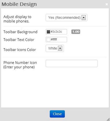
If you wish to use the adjusted mobile display, click on Design >> Mobile Design Settings >> select Yes (recommended) in the selection box next to Adjust display to mobile phones.
Mobile Design Settings
To change the mobile design settings, click on Design >> Mobile Design Settings.
- Adjust display to mobile phones - Fixes various display issues to make sure the website is displayed correctly on mobile phones.
- Toolbar Background - Sets the color for the page’s menu in the mobile.
- Toolbar Text Color - Sets the text color for the pages menu.
- Toolbar Icons Color - Sets the color of the icon for the pages menu.
- Phone Number Icon (Enter your phone) - Entering your phone number here will add a telephone icon to your adjusted mobile site. Clicking on this icon will enable to dial to the phone number entered.

|
|
|
|
|